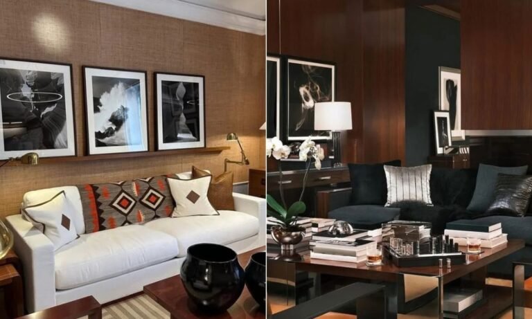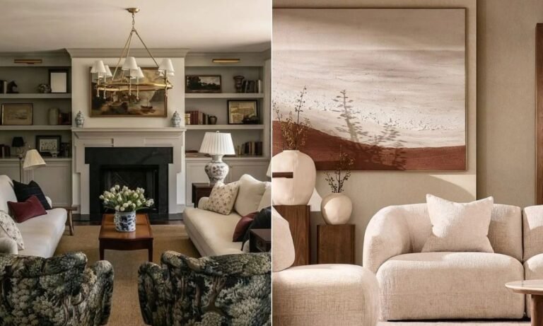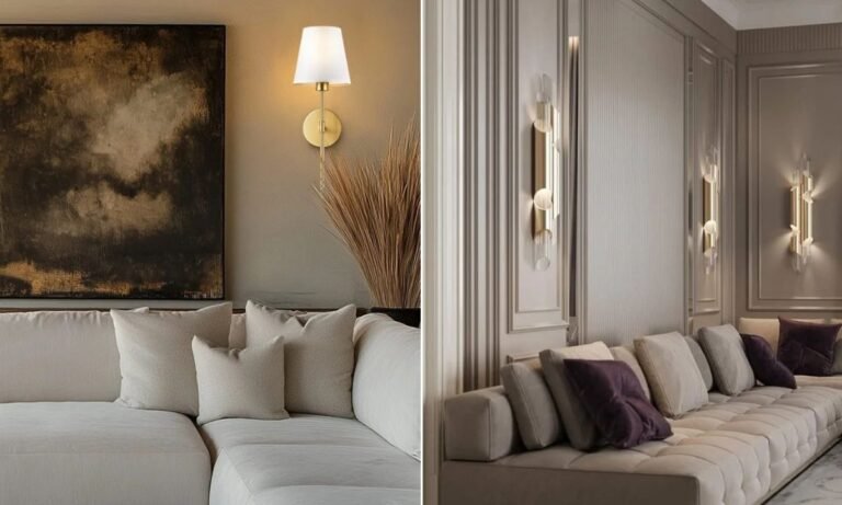
You save a living room because you love the pink sofa, another for its green walls, and another for that bright patterned rug.
Then you look at your own room and wonder how you can bring all those colors together without making it feel busy.
The trick isn’t using fewer colors; it’s knowing where each color belongs and which shades need to repeat.
You can start with one bold sofa, a colorful rug, artwork, or even a few smaller accents and build your palette from there.
In this article, you’ll find colorful living room ideas that show you how to mix bold shades, and work with furniture you already own.
Let’s jump in!
What Are the Trendy Colors for Living Rooms?
Living room colors are moving toward shades that feel warm, rich, and easy to live with.
Think earthy greens, butter yellow, terracotta, burgundy, dusty pink, warm blue, and deeper chocolate brown.
You don’t need to cover every wall with a trendy shade to make it work.

Try green or burgundy on a sofa, bring yellow through a chair or lamp, or use dusty pink in curtains and cushions.
If you love several colors, choose one as your main shade and repeat the others in smaller amounts around the room.
Warm wood, cream, or soft white can sit between stronger colors and keep the whole palette from feeling too busy.
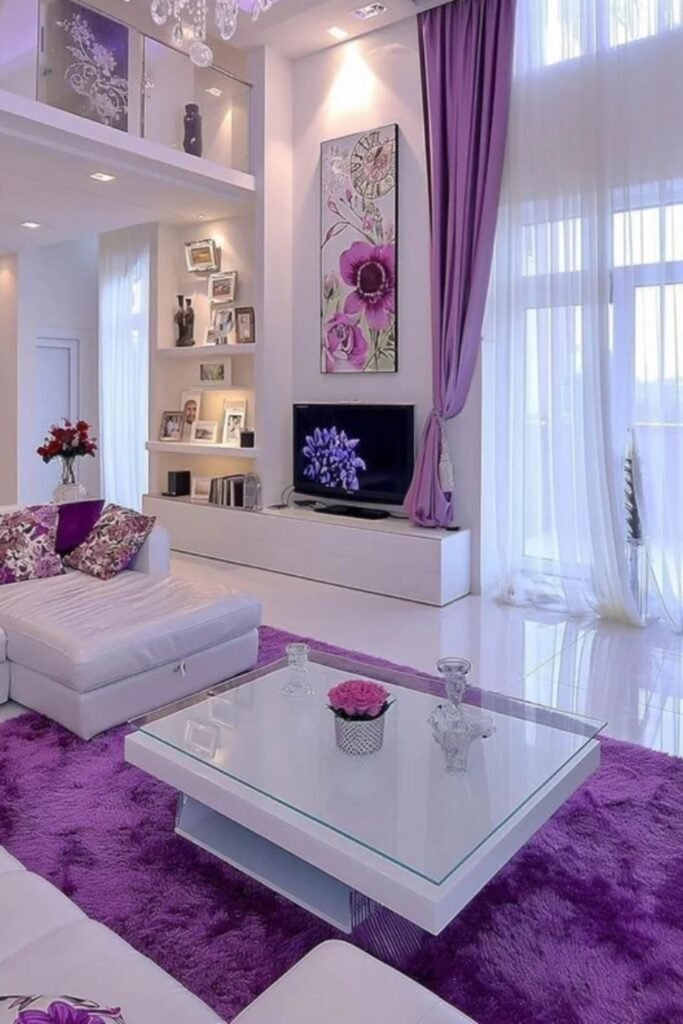
Purple Balance
Let purple do the decorating work by keeping your largest pieces white, then repeating violet across the rug, curtains, cushions, and artwork.
Choose this approach for bright living rooms where white walls and glossy furniture can handle stronger color without making the space feel heavy.
Finish with warm lamps or a chandelier at night, because softer lighting keeps cool purple accents from turning flat or overly sharp.
Earthy Color Mix
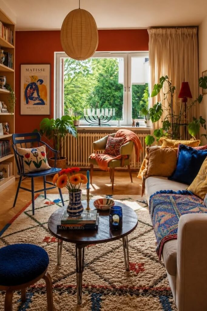
Start with a warm rust wall when you want several colors nearby, because its earthy tone gives blue and mustard something solid to contrast.
Pull those shades into cushions, throws, chairs, and artwork instead of matching everything, letting each piece contribute a small color moment.
This works especially well in book-filled living rooms, where natural wood, cream textiles, and leafy plants soften the brighter accents around them.
Punchy Accents
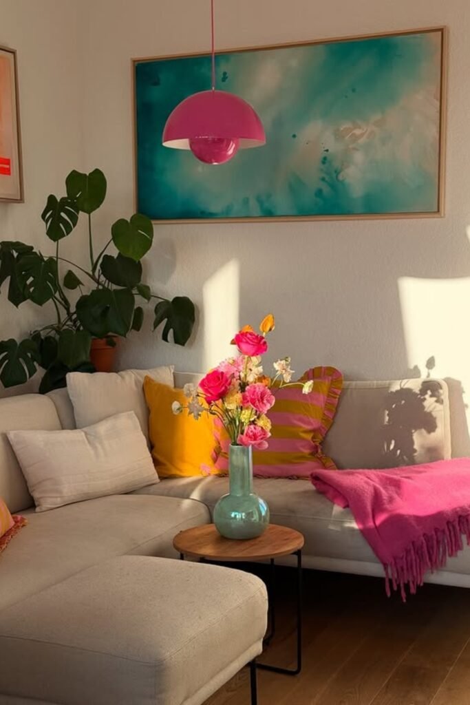
Give a neutral sectional new energy by choosing two punchy accent colors, then let one oversized artwork introduce a cooler balancing shade.
Pink and mustard work beautifully in smaller doses, so repeat them through cushions, flowers, a throw, or one playful pendant overhead.
Keep the walls and main upholstery quiet for this approach; the empty background gives every bright accent enough room to stand out.
Pink Gallery
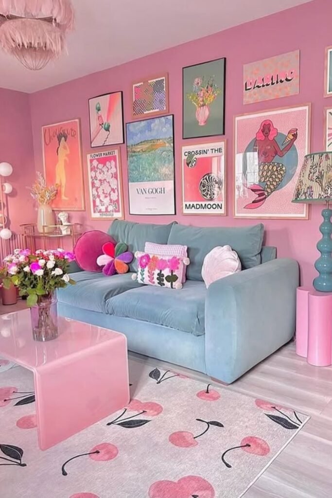
Pink walls can carry more color than you might expect when a cool blue sofa breaks up the warmth and anchors the room.
Instead of scattering random accessories, repeat pink through the table, rug, cushions, and artwork so the palette feels planned from floor upward.
Try this in a playful family room or creative apartment, using varied artwork and one patterned lampshade to keep the scheme personal.
Blush Layers
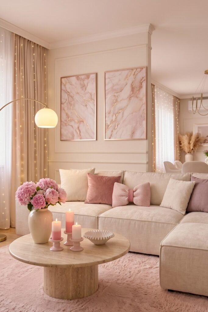
Soft pink works best when you want color without intensity, especially in bright rooms where cream furniture already creates a calm base.
Repeat blush through rug, cushions, flowers, artwork, and candles, while natural wood and beige keep the palette from becoming overly sweet.
Use warm floor lighting and tiny curtain lights after sunset to give pale pink more depth without adding another strong color.
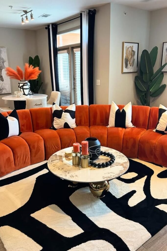
Burnt Orange
Let a burnt orange sectional become the clear focal point, then use black and cream around it to control the energy.
A bold patterned rug can carry those grounding shades across the floor, making such a large orange sofa feel deliberately placed.
Try this in modern open living rooms, adding leafy plants and simple artwork so the strong seating remains the main statement.
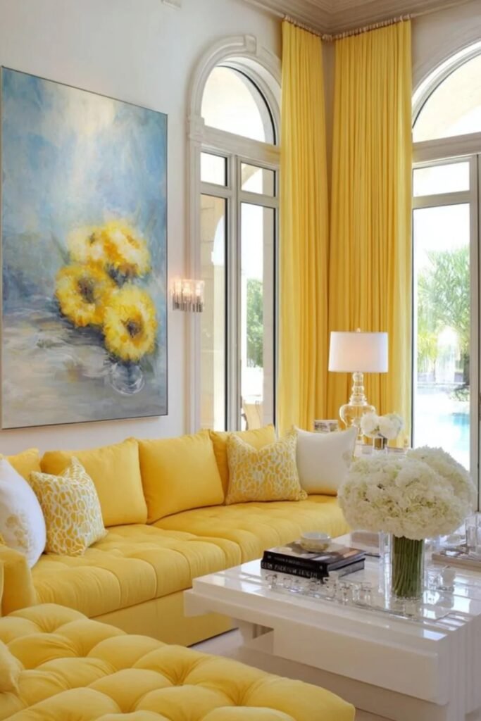
Sunshine Yellow
Sunshine yellow can cover a large sofa when the room receives generous daylight, because white walls and flooring prevent visual heaviness.
Carry the yellow upward with full-length curtains and into artwork, giving the strong furniture color a clear connection across the room.
Keep tables, flowers, and smaller cushions mostly white here; that restraint lets one cheerful shade dominate without needing several competing accent colors.
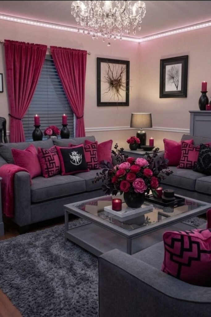
Pink Contrast
Gray furniture gives hot pink a grown-up foundation, so you can use the brighter shade repeatedly without letting it overwhelm everything.
Bring pink onto curtains, cushions, flowers, candles, and throws, then add black details to sharpen the contrast and connect separate areas.
This combination suits larger seating areas especially well, where repeated gray surfaces provide enough breathing room for strong magenta accents to circulate.
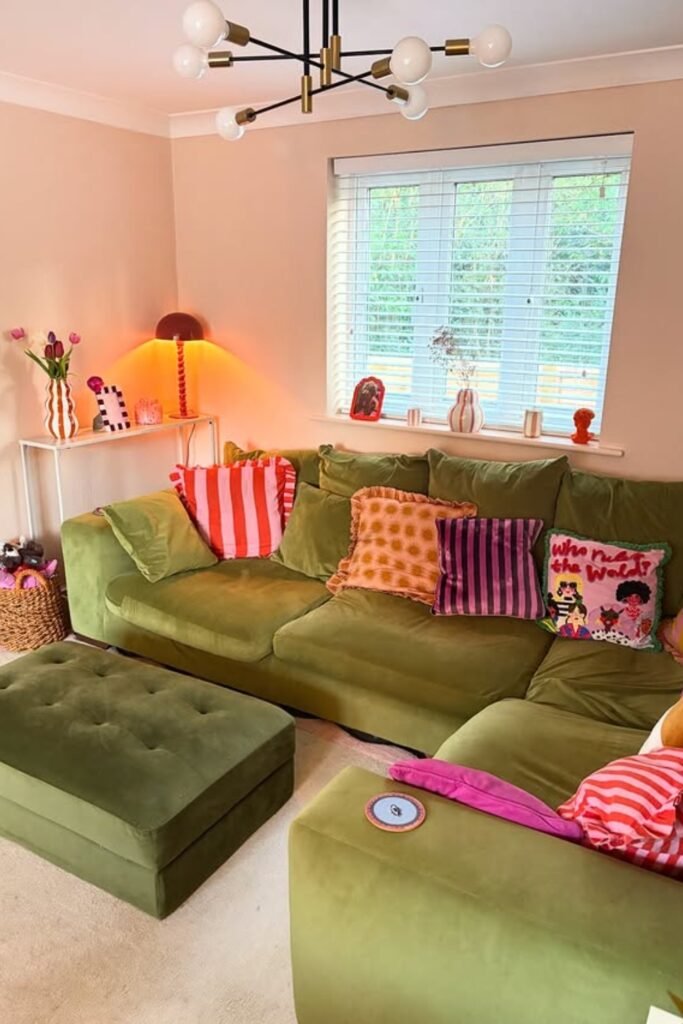
Olive Play
When your sofa already carries strong olive green, use striped pink and orange cushions to bring brighter colors in without replacing furniture.
Keep the walls softly neutral and let the sectional cover most of the room, giving those smaller patterned accents space to shine.
This approach suits family rooms where comfort matters, while one warm table lamp makes the green upholstery feel richer after dark.
Quiet Color
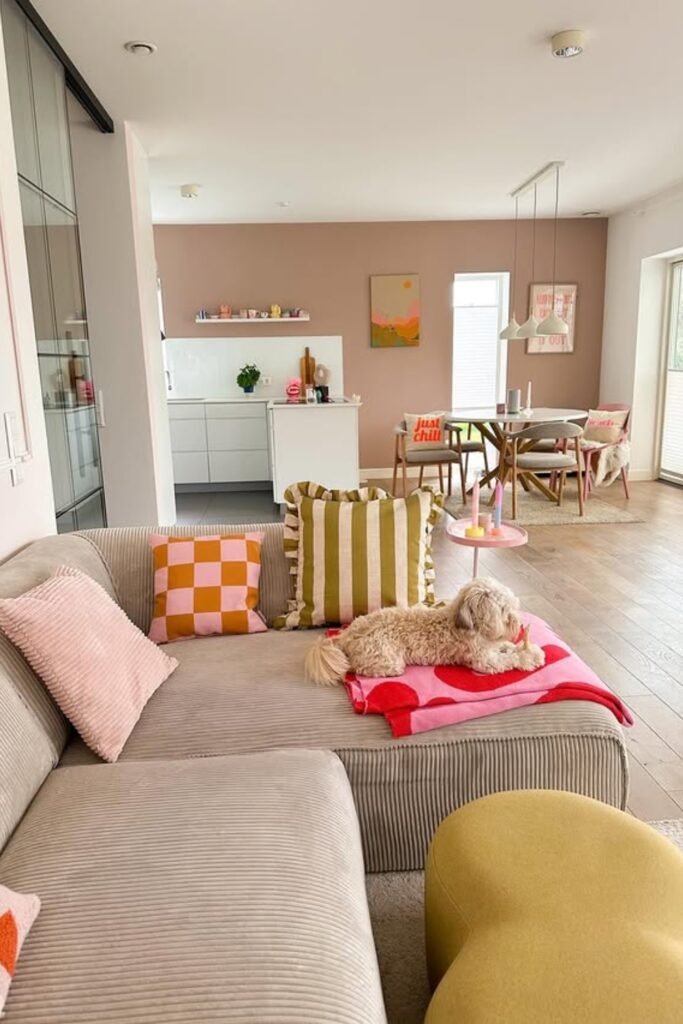
You can make an open living room colorful without filling it with bold furniture by concentrating brighter shades into movable smaller pieces.
Start with a neutral sofa, then layer pink, olive, and orange through cushions, throws, stools, artwork, and occasional tables nearby.
Keeping those accents portable works especially well in open-plan homes, because you can change the palette without disturbing larger connected spaces.
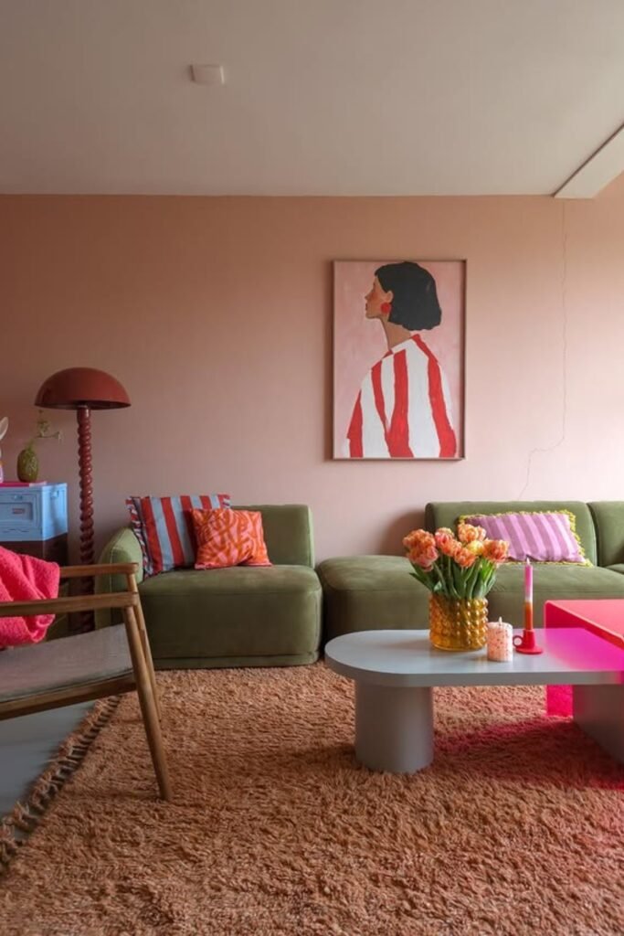
Retro Palette
Olive green becomes much more playful beside coral and pink, especially when you spread those warmer shades across different furniture and accessories.
Use striped cushions, orange flowers, and one bright pink table rather than matching pieces, letting each accent bring its own character.
A peach wall and brown textured rug soften the contrasts underneath, making this combination especially comfortable for relaxed retro-inspired living rooms.
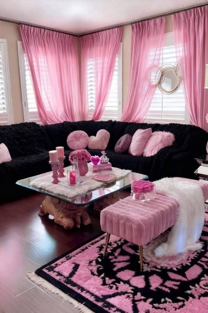
Pink And Black
Pairing sugary pink with deep black creates instant structure, giving you freedom to use softer feminine details without making everything feel overly delicate.
Let black dominate the sectional and repeat pink through curtains, cushions, stools, candles, and rugs so both colors stay visually connected.
This pairing works well in spacious rooms with several windows, where daylight keeps the black furniture from making the seating area heavy.
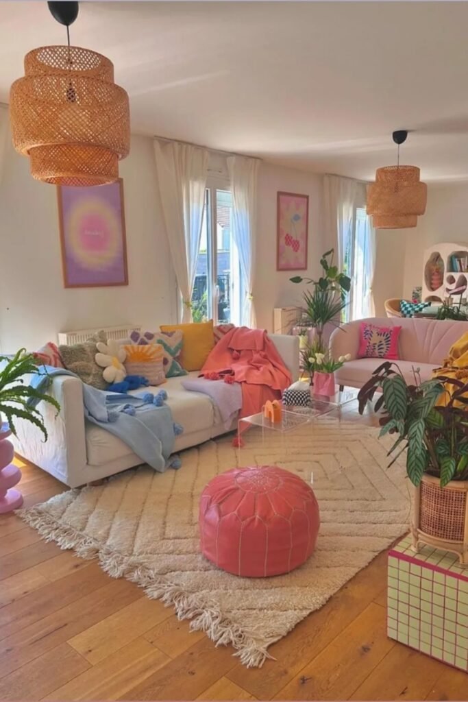
Pastel Scatter
You don’t need matching furniture to make pastels work; spread pink, blue, yellow, and lilac across separate pieces instead of grouping them.
Keep the sofa and rug creamy so colorful throws, cushions, artwork, and a coral pouf can stand apart without fighting each other.
Use this approach in casual living rooms, then add leafy plants and woven lighting to bring natural texture between all those softer colors.
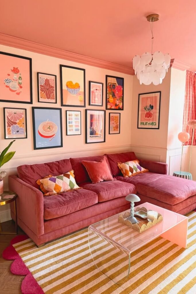
Coral Cocoon
Take one warm color beyond the sofa by carrying coral onto the ceiling, artwork, curtains, and smaller accents around the room.
The trick is varying its depth, using dusty rose upholstery beside lighter peach walls so everything doesn’t become one flat block.
A striped neutral rug and black picture frames break up the warmth, making this approach easier to use in compact living rooms.
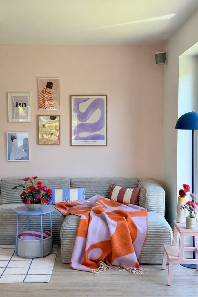
Lavender And Orange
Orange and lavender feel surprisingly easy together when a pale gray sofa acts as the quiet middle ground between both stronger shades.
Introduce the combination through a large throw first, then echo lavender in artwork and orange through flowers or smaller patterned cushions.
This is a smart option for neutral rooms needing color gradually, since changing textiles later costs far less than replacing major furniture.
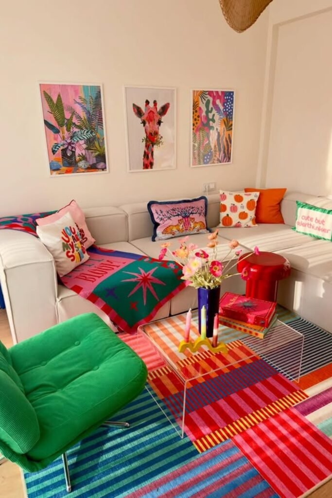
Rainbow Grounding
When several bright colors are competing, place them over a multicolored rug that already contains similar shades and instantly connects the palette.
Keep your largest sectional white, then bring green, orange, pink, red, and blue through chairs, cushions, throws, artwork, and accessories.
This method works beautifully for energetic family rooms, because the neutral seating gives busy patterns enough breathing space to remain enjoyable.
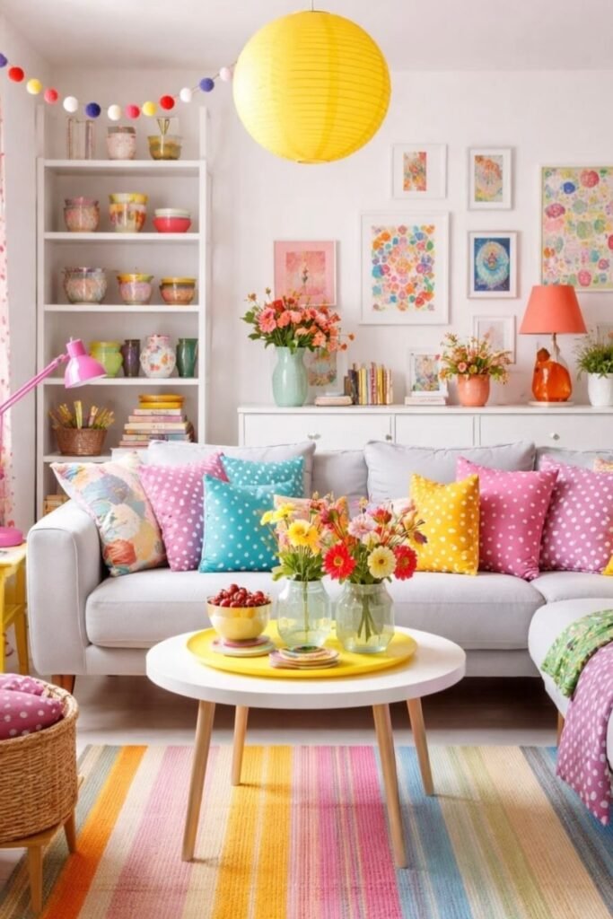
Candy Accents
Make a neutral sofa feel cheerful by repeating pink, turquoise, and yellow across cushions, lamps, artwork, flowers, and smaller decorative pieces.
Choose simple polka dots and florals in related shades, so different patterns can sit together without making the seating area confusing.
A striped pastel rug spreads those colors across the floor, while white walls and furniture leave enough breathing room around everything.
Sunny Pairing
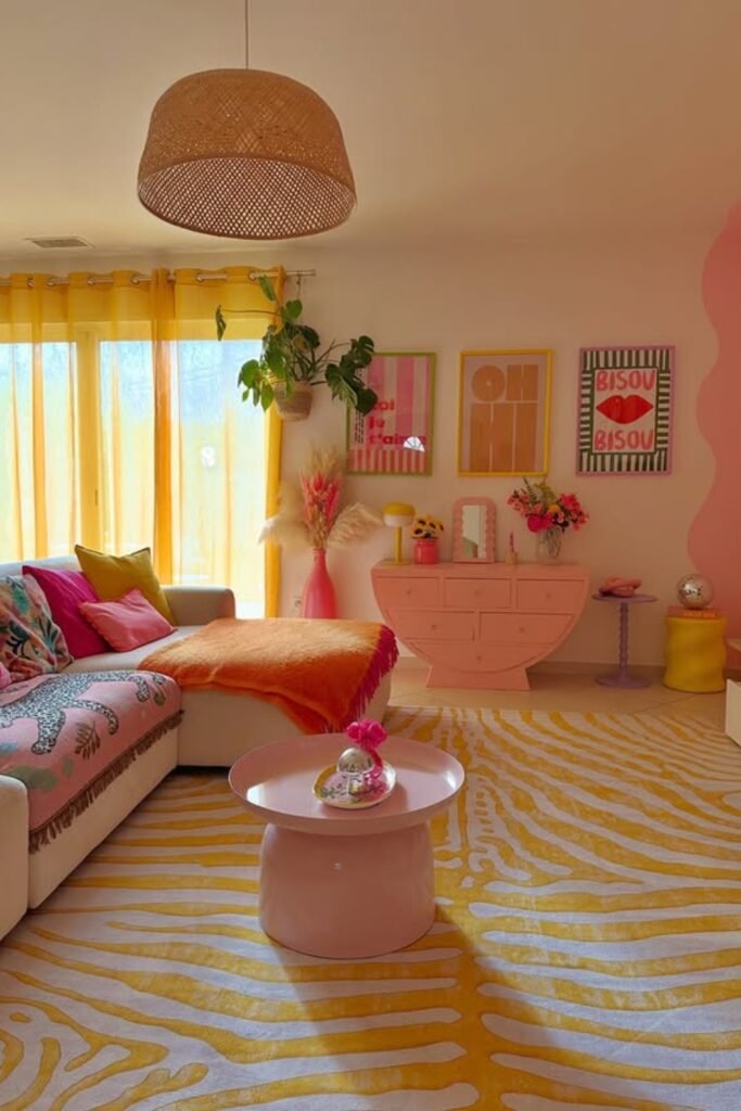
Yellow and pink can carry an entire room when you vary their proportions instead of giving both colors equal visual weight.
Let yellow lead through curtains and a patterned rug, then bring pink onto furniture, artwork, flowers, and smaller occasional pieces.
This pairing works beautifully in sunny rooms, where warm daylight strengthens both shades and white upholstery prevents them from becoming overwhelming.
Lavender Mix
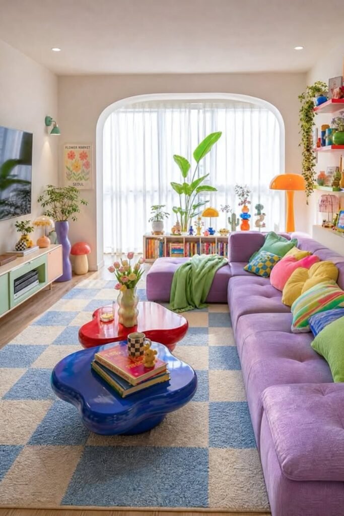
Choose a lavender sectional as your main color statement, then surround it with smaller accents that feel playful rather than perfectly matched.
Blue tables and a checked rug cool the purple down, while green, yellow, pink, and orange cushions bring controlled contrast.
Keep the walls white for this combination, especially in smaller rooms, because the colorful furniture already gives your eye plenty to explore.
Mustard Warmth
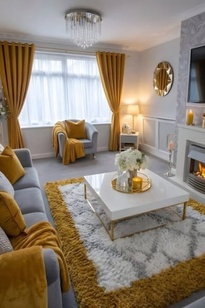
Mustard is an easy starting color when gray furniture feels too cool, because its golden warmth immediately changes the room’s mood.
Repeat it through curtains, cushions, throws, and the rug border, while leaving larger upholstery and walls in softer gray tones.
This works particularly well in traditional living rooms, where warm lamps, metallic details, and a fireplace make mustard feel even richer.
Yellow Punch
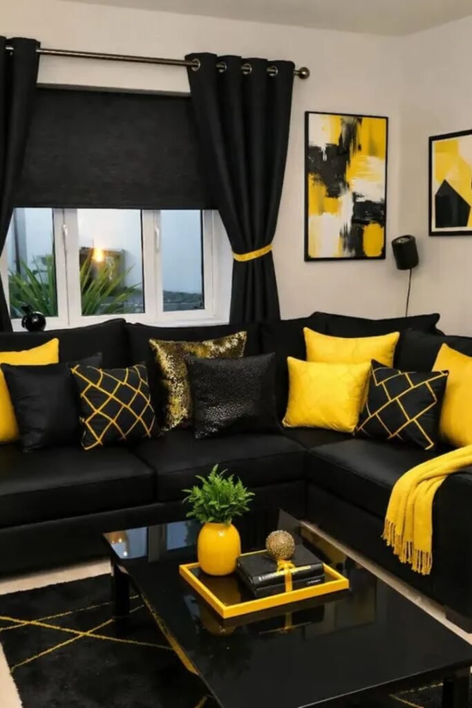
Black furniture can handle a very bright accent, so use sunny yellow where you want the eye to land without adding extra colors.
Repeat yellow through cushions, a throw, artwork, and one small vase, while keeping curtains, tables, and rugs mostly deep black.
Choose this pairing for compact modern rooms when you want strong color contrast but still prefer a controlled two-color decorating scheme.
Burnt Orange Glow
Deep gray becomes warmer when burnt orange appears through velvet chairs, throws, cushions, flowers, and artwork instead of covering every large surface.
Layer several orange tones from rust to copper, giving the room depth while black and white accents keep everything visually grounded.
Warm wall sconces and candles suit this palette especially well, because their golden light makes those earthy orange textiles feel even richer.

Mustard And Green
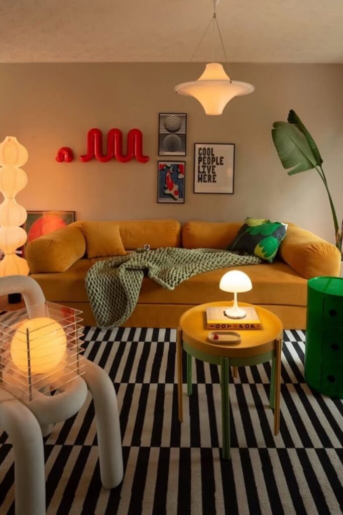
Mustard and green make a strong retro pair, especially when black and white patterns are used underneath to separate both saturated colors.
Let mustard lead through the sofa, then introduce green on one cabinet and cushion rather than spreading it equally around the room.
Try this combination in a creative living space, using sculptural lamps and graphic artwork to continue the playful mood without extra clutter.
Dark Backdrop
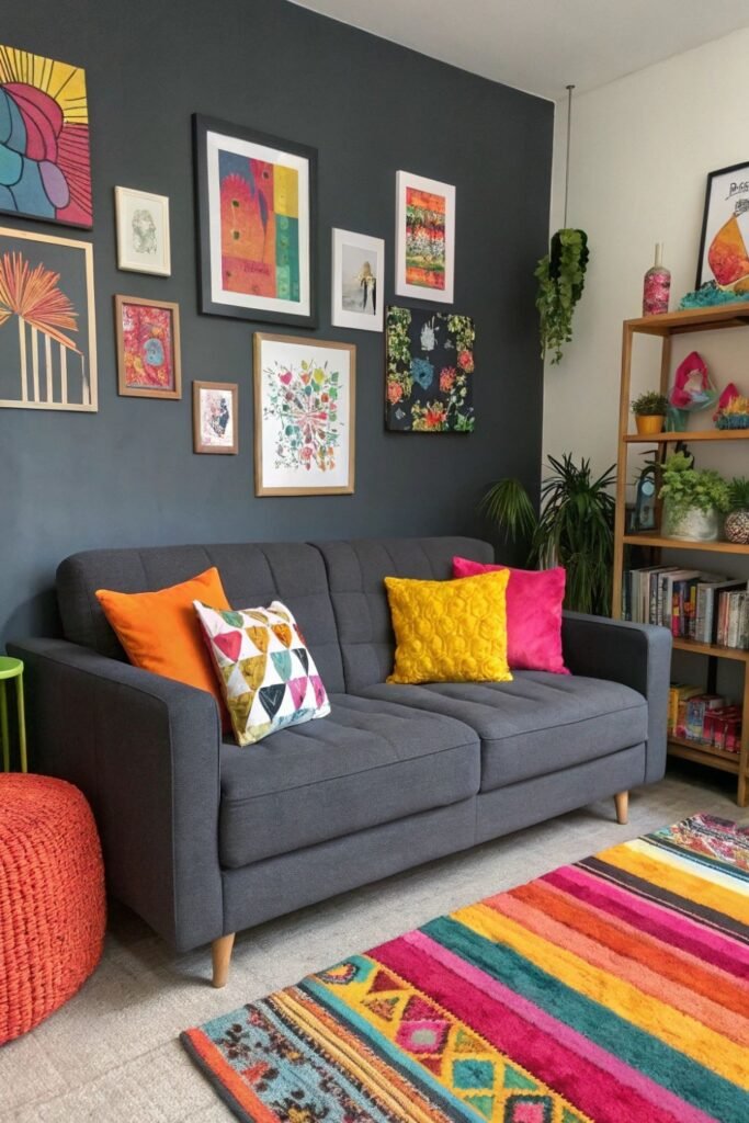
A charcoal wall can actually make bright colors easier to manage, because orange, yellow, pink, and turquoise stand clearly against it.
Start with a gray sofa, then borrow shades from a multicolor rug for cushions and artwork so every accent has a connection.
This works well when you love many colors but prefer darker walls, while plants and natural wood prevent the room feeling too enclosed.
FAQs
How Can I Add Color Without Replacing My Neutral Furniture?
Keep your existing beige, gray, or white sofa and introduce color through pieces that are easier and cheaper to change over time.
Start with a colorful rug or artwork, then repeat two or three of those shades through cushions, throws, lamps, and smaller decor.
Keeping expensive furniture neutral also gives you more freedom to change your color palette later without having to redesign the entire living room.
How Many Colors Can I Use In One Living Room?
There is no fixed limit, but choosing one dominant color first makes several additional shades much easier to balance around the room.
Repeat your main accent colors in different places, while leaving some walls, furniture, or flooring quieter to give your eyes breathing space.
If the room starts feeling busy, reduce competing patterns or bright accessories before removing colors, since better balance often solves the problem.