Choosing living room wallpaper gets confusing fast because a pattern can look perfect online but feel too busy beside your sofa.
The good part is that once you match the wallpaper to what your room actually needs, choosing the right color, and scale.
In this article, you’ll find practical living room wallpaper ideas that show what works, and where to use it.
Let’s jump in
Which Color Wallpaper Is Best for a Living Room?
The best wallpaper color depends on your room’s light, sofa color, floor, and how much contrast you actually want.
Light beige, cream, soft green, and warm taupe work well when you want the living room to feel brighter and calmer.
Darker shades like navy, charcoal, or forest green suit larger or brighter rooms because they add depth without feeling too heavy.
If your sofa already has a strong color, choose wallpaper with softer tones so the room does not start competing with itself.
Neutral furniture gives you more freedom, so you can bring in florals, botanicals, earthy colors, or stronger patterns without overwhelming the space.
Before choosing anything, tape a wallpaper sample to the wall and check it in both daylight and evening light.
Soft Florals
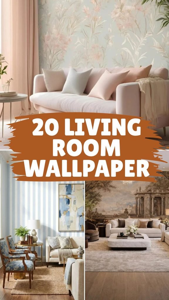
Pair a pale floral wallpaper with blush seating when you want a soft living room that still feels layered, not overly sweet.
Keep the larger furniture simple and repeat only one wallpaper color through cushions or curtains so the pattern stays calm and connected.
This works especially well in bright rooms, where natural light keeps pastel tones fresh and prevents delicate florals from looking washed out.

Scenic Mural
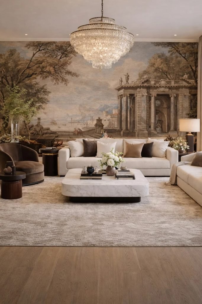
Use a full-wall scenic mural behind the main sofa when you want the wallpaper to act like artwork instead of background decoration.
Keep sofas, rugs, and tables mostly neutral because a detailed landscape already gives the room plenty of movement, depth, and visual interest.
Choose this approach for a wide uninterrupted wall, then avoid covering key parts of the scene with tall furniture or crowded shelving.
Vertical Stripes
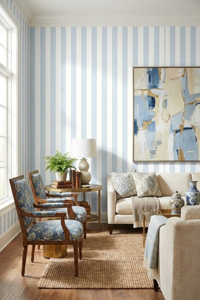
Vertical blue stripes are useful in a shorter living room because they pull your eye upward and make the walls feel more structured.
Balance the crisp pattern with plain upholstery, warm wood, and one larger artwork so the room feels collected rather than overly nautical.
Repeat the wallpaper blue in smaller accents instead of matching everything exactly; that keeps the palette connected while letting each piece stand alone.
Framed Mural
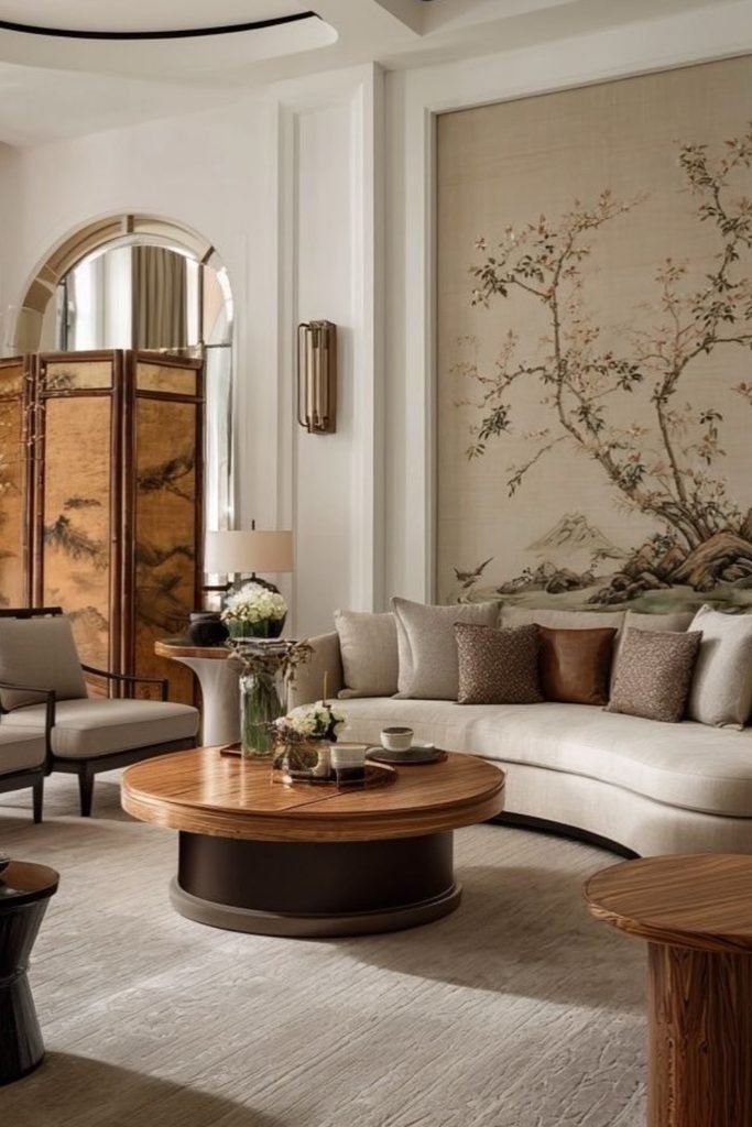
Frame a delicate mural inside wall molding when you want strong wallpaper impact without covering every wall or overwhelming a formal living room.
Center the sofa below the panel and keep surrounding walls quiet, which lets the wallpaper behave more like oversized art than decoration.
Warm wood tables, cream upholstery, and muted cushions work especially well here because they support the mural without stealing attention from its detail.
Paneled Botanicals
Wallpapering only above wall paneling keeps a botanical print controlled, which works well when you want pattern without covering the entire room.
Paint the lower panels in a soft neutral, then repeat one leaf tone through cushions so the whole living room feels connected.
This setup suits smaller or traditional spaces especially well because the paneling adds structure while the light wallpaper keeps everything from feeling heavy.

Green Geometry
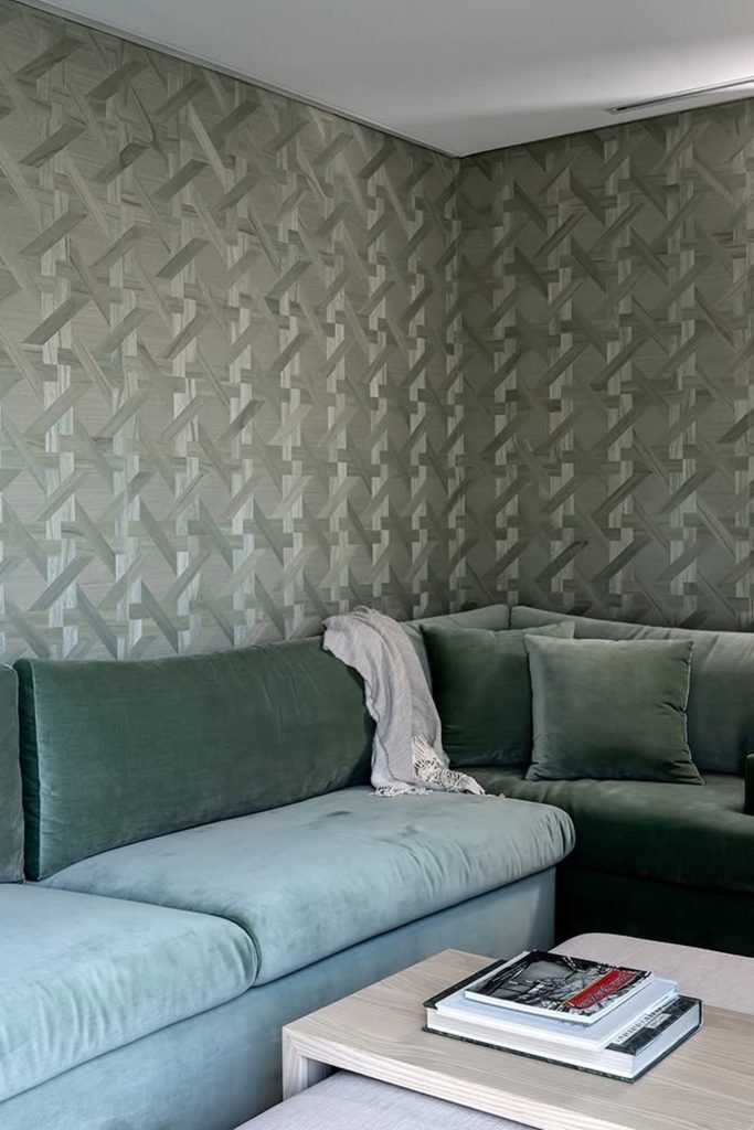
A muted geometric wallpaper can handle a large sectional because the tonal pattern adds movement without introducing several competing colors around the seating.
Wrap the paper across adjoining walls when you want the corner to feel intentional, then keep tables and accessories simple and low.
Choose this approach for modern living rooms with strong upholstery, where repeating similar greens creates depth instead of a sharp feature-wall contrast.
Quiet Botanicals
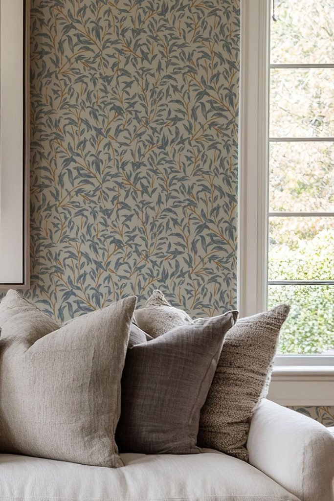
Busy leaf patterns feel much calmer when the background stays warm and muted, so they work beautifully beside soft neutral upholstery and daylight.
Let the wallpaper carry the detail, then use plain cushions in stone, taupe, or brown instead of adding another obvious print nearby.
This is a smart choice for relaxed living rooms where you want nature-inspired character without turning the sofa wall into a dramatic statement.
Forest Mural
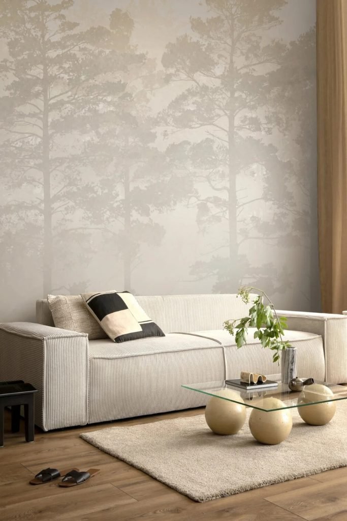
A pale forest mural gives a blank sofa wall depth without strong color, making it useful when you want interest in a minimalist room.
Keep the furniture low and simple so the tall tree shapes stay visible, and use warm wood to stop the palette feeling cold.
This works best on one uninterrupted wall, especially in bright living rooms where soft daylight can strengthen the misty layered effect.
Botanical Mural
An oversized botanical mural works best on a wide sofa wall because the large leaves create impact without needing extra artwork.
Keep the sofa, rug, and tables mostly neutral, then repeat one muted leaf tone through cushions so the room stays balanced.
This approach suits larger living rooms especially well, where a full-scale pattern can fill empty wall space without making everything feel cluttered.

Garden Print
A dense floral wallpaper can warm up a plain living room when the furniture stays simple and the colors remain soft.
Pull two shades from the print into cushions or an ottoman instead of matching every flower, which keeps the scheme relaxed.
Place the wallpaper behind the main sofa so it anchors the seating area, while nearby neutral walls give your eyes a break.

Sepia Forest
A sepia forest mural gives a neutral living room depth without strong color, so it works beautifully with cream or beige upholstery.
Keep the rest of the palette earthy and quiet, then add rust, olive, or navy cushions for controlled contrast against the scenery.
This treatment is especially useful on tall walls because the vertical tree shapes make the room feel layered rather than empty.

Chinoiserie Drama
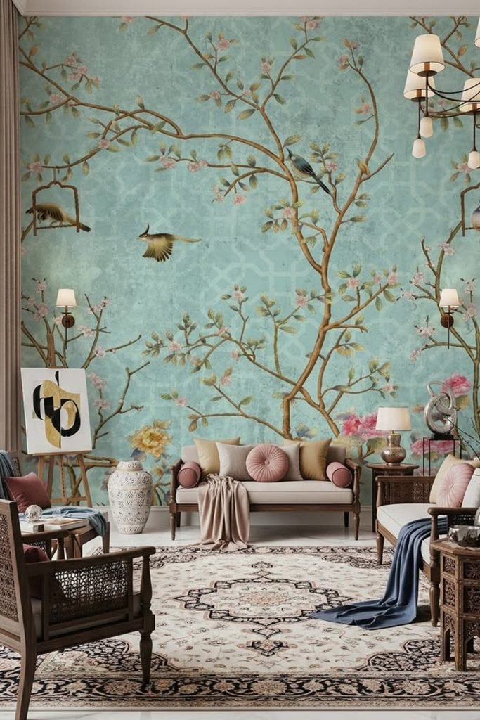
A turquoise chinoiserie mural earns its place in a larger living room, where tall ceilings give the branching design enough breathing space.
Let the mural lead the palette, then echo its pinks, browns, and blues sparingly through cushions, throws, or smaller decorative pieces.
Traditional wood furniture works especially well here because its darker finish grounds the airy background and keeps the room from feeling overly sweet.
Floral Panels
Framing bold floral wallpaper inside wall molding gives a dark living room detail without letting the pattern take over every surface.
Pair deep green walls with mustard seating when you want richer contrast, then repeat one wallpaper shade through cushions for connection.
This works especially well in compact sitting areas because the framed sections feel decorative while still leaving plenty of solid wall visible.

Paneled Florals
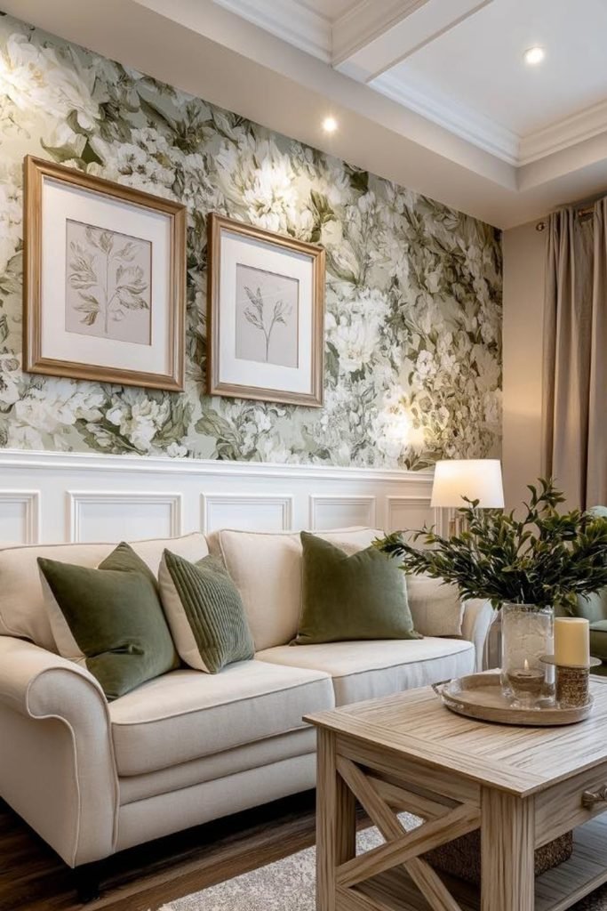
Covering only the upper wall with large white florals keeps the pattern bright, while painted paneling gives the room a cleaner base.
Pull olive green from the leaves into cushions and an accent chair, then keep the sofa cream so everything stays easygoing.
Use this treatment in smaller traditional living rooms when full-height wallpaper feels too busy but plain painted walls still feel unfinished.
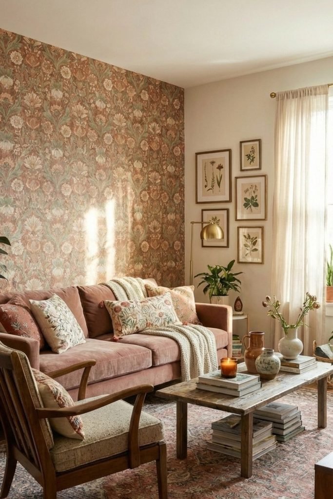
Vintage Florals
A muted floral wall can carry a rosy sofa surprisingly well when both share dusty tones instead of sharp, high-contrast colors.
Keep nearby walls plain and bring in worn wood, botanical art, and layered textiles so the room feels collected rather than matched.
This approach suits cozy living rooms where you want wallpaper to add warmth and personality without pushing the whole space toward maximalism.
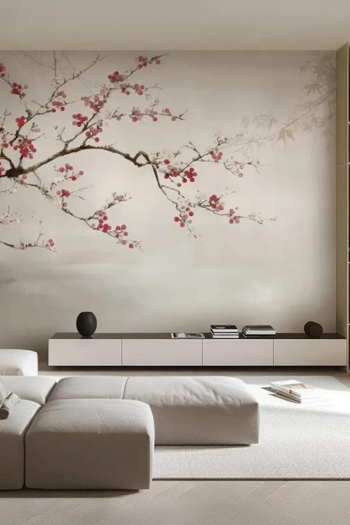
Blossom Mural
A single blossom branch across a pale wall gives minimalist living rooms interest without filling the background with a repeating pattern.
Let the mural stretch above low furniture, because keeping the lower wall open makes the branch feel wider and more intentional.
Choose this for a calm modern room, then repeat the blossom color only once or twice so the artwork remains the focus.
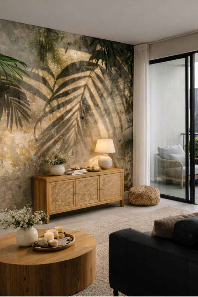
Tropical Texture
A shadowy palm mural can warm a modern living room because the earthy background keeps the greenery dramatic without feeling overly tropical.
Pair it with natural wood, woven pieces, and one dark sofa so the wall feels grounded instead of looking like themed decor.
This works best in bright rooms, where strong daylight can lift the deeper tones and stop the feature wall from feeling heavy.
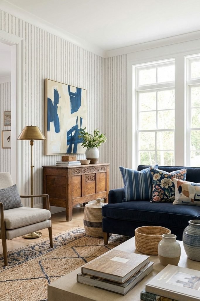
Fine Stripes
Fine vertical stripes suit a classic living room when you want pattern on every wall without making the space look overly busy.
Keep the stripe narrow and low contrast, then let a navy sofa and warm wood furniture bring stronger color into the room.
Large windows help this treatment stay light, while abstract art and mixed cushions keep the repeated lines from feeling too formal.
Warm Ginkgo
Oversized ginkgo leaves create a softer statement than busy florals, especially when you choose warm beige and blush instead of sharp contrast.
Use the mural behind a cream sectional, then repeat its warm tones through cushions and brass lighting to keep the palette connected.
This approach works beautifully in rooms with arches or warm wood, where the organic pattern supports the architecture rather than competing.

Framed Landscape
A framed landscape mural gives a formal living room one clear focal point, which keeps the rest of the walls calm and balanced.
Center the mural above a curved sofa, then use matching sconces on both sides so the wall reads like built-in artwork.
Keep the upholstery and rug quiet, because detailed scenery already brings enough movement and works best when furniture does not interrupt it.

FAQs
Should Wallpaper Match Curtains?
Your wallpaper and curtains do not need to match exactly; repeating one shared color usually makes the living room feel more natural.
If the wallpaper has a busy print, choose solid curtains or a quieter texture so both surfaces are not competing visually.
With subtle wallpaper, you can bring in patterned curtains, but change the pattern scale so the room still feels balanced.
Can You Hang Art Over Wallpaper?
Yes, artwork can sit over wallpaper, but the wall works best when one element clearly takes the lead instead of competing.
A quiet texture or small repeat can handle larger artwork, while a mural usually needs more open space around its main scene.
Use simple frames and leave breathing room between pieces, especially when the wallpaper already carries strong color, detail, or movement across the wall.